

Choosing the right color temperature when lighting commercial, industrial, or sports spaces is more than a minor detail—it’s a strategic decision that impacts ambiance, functionality, and overall aesthetics. The choice of lighting affects how people perceive and interact with a space. Understanding the nuances between different color temperatures, which typically range from 2700K to 6500K, can help architects, designers, and business owners create tailored environments. This guide breaks down the attributes, applications, and ideal use cases for various color temperatures to help you make an informed decision.
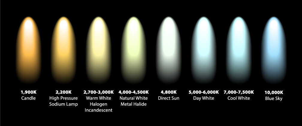
A Quick Overview of Color Temperature Color temperature—measured in Kelvin (K)—describes the visual warmth or coolness of light. Spanning from 1000K to 20,000K, this scale moves from warmer, yellowish tones to cooler, bluish hues. LED lights excel at mimicking the natural light spectrum, corresponding to VIBGYOR (violet, indigo, blue, green, yellow, orange, and red), the colors visible to the human eye.
By understanding this spectrum and its role in lighting and color theory, we gain insight into how light influences our perception of spaces.

Beyond aesthetics, color temperature has biological and emotional effects. Warm tones promote calmness and relaxation, while cooler tones enhance alertness and productivity. These differences are particularly relevant in fields like photography and publishing, where accurate color rendering is critical.
Moreover, lighting’s impact extends to our physiology—cooler lights stimulate serotonin release to enhance focus, while warmer lights encourage melatonin production for relaxation. This interplay between function and mood underscores the importance of choosing appropriate color temperatures for different settings.
While residential areas often lean toward warm lights for a comforting atmosphere, commercial and industrial spaces gravitate toward cooler tones to foster productivity or visibility. Now that we’ve covered the basics, let’s dive into specific comparisons between key color temperatures and their ideal applications.
2700K vs 3000K

Warmer color temperatures like 2700K and 3000K are frequently used in outdoor spaces where minimizing light pollution is a priority.
2700K: Producing a soft orange-toned glow, 2700K is ideal for outdoor applications such as streetlights, parking lots, parks, and marine-sensitive environments. This tone strikes a balance between effective illumination and environmental considerations while ensuring safety where needed. –
3000K:Slightly crisper with a more neutral appearance, 3000K offers versatility. In addition to outdoor applications, it works well in workshops to create a warm but functional atmosphere for enhanced productivity.
2700K vs 4000K
The shift from 2700K’s warm glow to 4000K’s neutral white light is significant.
4000K:Known for its balanced brightness, this neutral tone is ideal for multifaceted applications such as factories, warehouses, sports fields, and parking areas. Its clarity is especially valued in sports lighting, offering a visually appealing experience for spectators while providing safe working conditions in industrial settings.
2700K vs 5000K
As we move further up the Kelvin scale, the difference between 2700K and 5000K becomes even more pronounced.
5000K: This bright white light delivers a stimulating effect suited for high-performance spaces like industrial workshops, hospitals, and security zones. Its sharp illumination supports tasks requiring precision and focus, making it excellent for technical and medical environments.
3000K vs 5000K
The comparison between 3000K’s gentle warmth and 5000K’s stimulating brightness highlights distinct use cases for each.
3000K: This warm white light feels inviting without overwhelming spaces with orange undertones. It’s ideal for workshops where maintaining comfort is important without compromising functionality.
5000K: Meanwhile, the invigorating brightness of 5000K is perfect for dynamic environments such as sports arenas, factories, laboratories, and retail stores. However, this stark light can sometimes feel sterile in smaller rooms; in those cases, opting for warmer tones like 3000K may be more suitable to preserve an inviting atmosphere.
4000K vs 6500K
At the cooler end of the Kelvin spectrum, the differences between 4000K and 6500K are focused on creating intense clarity or tailored illumination.
4000K:With its neutral tone, this color temperature is versatile enough for settings like factories, warehouses, sports fields, and parking lots. It provides a balance between visual comfort and productivity during prolonged tasks or shifts.
6500K:On the other hand, 6500K represents one of the coolest tones available—emulating daylight. This makes it effective for applications that require maximum brightness and near-natural visibility, such as inspection areas or highly detailed technical work.
5000K vs. 6500K
When comparing 5000K and 6500K, both belong to the cooler spectrum of light. However, 6500K stands out with its brighter intensity and a noticeable blue hue. While 5000K offers a color similar to natural daylight, 6500K resembles the vibrant clarity of a clear blue sky.
This makes 6500K a common choice for environments demanding high brightness and sharp visibility, such as hospitals and clean rooms. On the other hand, 5000K is often favored in spaces like retail stores, offices, and parking lots, where sufficient brightness is needed without the overly intense glare of 6500K.
A Visual Breakdown of Color Temperatures

Understanding how different color temperatures work can benefit from a visual representation. This helps illustrate our explanations and gives a clearer picture of how these lighting options perform across various settings. Final Thoughts: Choosing the Right Temperature for Your Space Selecting the correct color temperature is crucial for achieving the desired functionality and ambiance in your environment. Cooler temperatures (4000K and above) are ideal for areas requiring focus and precision, such as warehouses, sports facilities, and manufacturing sites. Conversely, warmer temperatures (around 2700K) create a more inviting atmosphere, which makes them better suited for spaces like parks or more welcoming environments.
To make the best decision, consider the specific needs of your space and the purpose of the lighting. This guide aims to help you choose lighting that not only brightens your area but also enhances its utility and design. A well-informed choice will ensure both functional and aesthetic success in your lighting setup.